
Brand & Product System · 2025
SmartRoot Systems
Full brand system for connected indoor farming: identity, packaging, companion app UI, and retail spatial concept designed as one cohesive system.
Role
Brand & UX Designer
Year
2025
Scope
Identity, packaging, UI, spatial
Tools
Figma, Illustrator
Overview
One brand idea across every touchpoint.
A concept project testing whether one design system can hold across identity, packaging, digital UI, and physical space.
Core tension: make a technical product feel approachable without losing credibility. If the same principles work on a 2-inch app icon and a 6-foot booth, the system is real.
Graphic Identity
Circuit trace meets root system.
Geometric tree form with circuit node endpoints. Branches grow upward (plant), roots extend down (network). One mark that reads as both technology and organic growth.
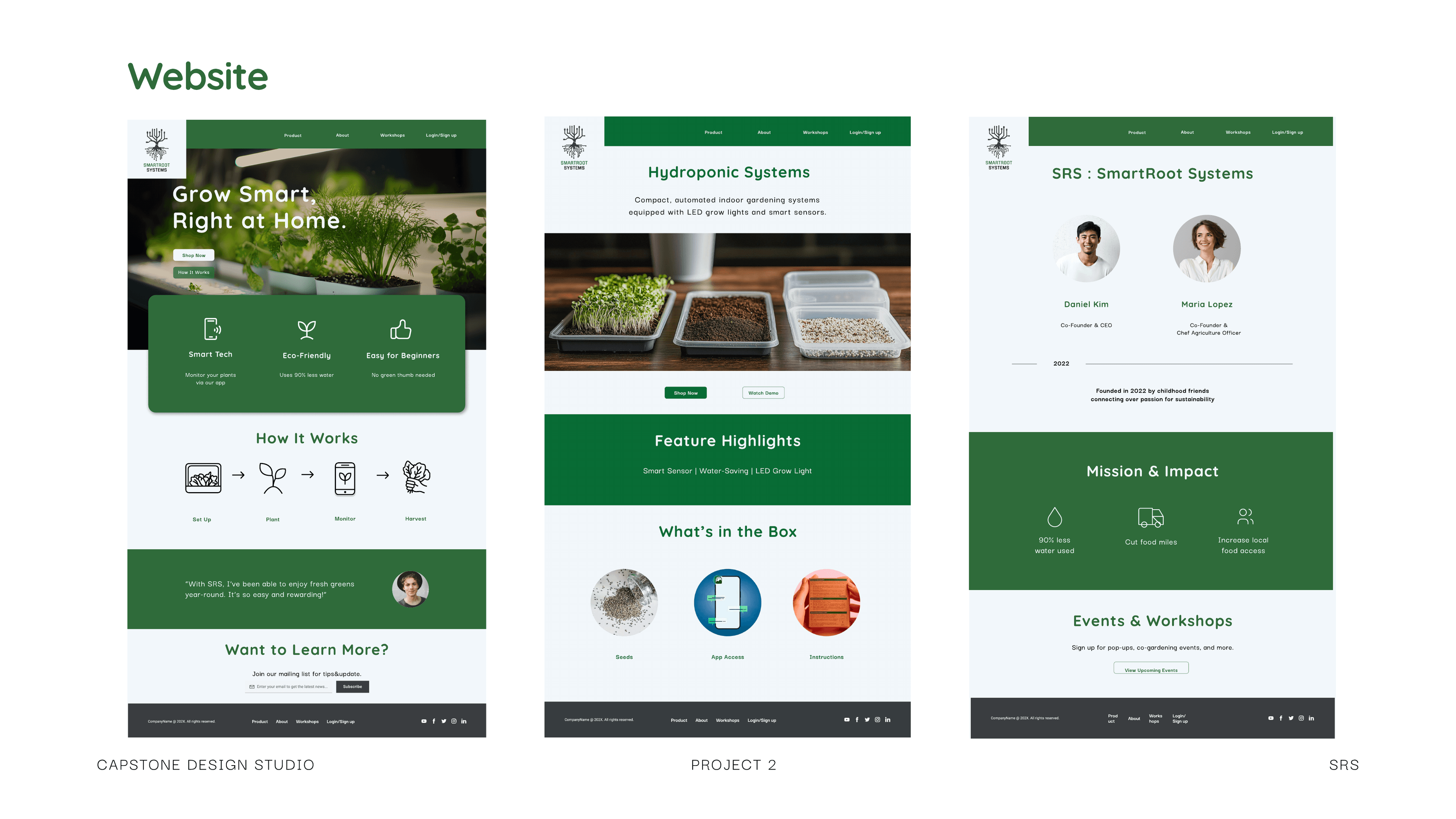
Website
Brand storytelling and product discovery.
Two audiences: home growers who need simplicity, and enthusiasts who want depth. Progressive disclosure: lifestyle benefits first, specs on demand.
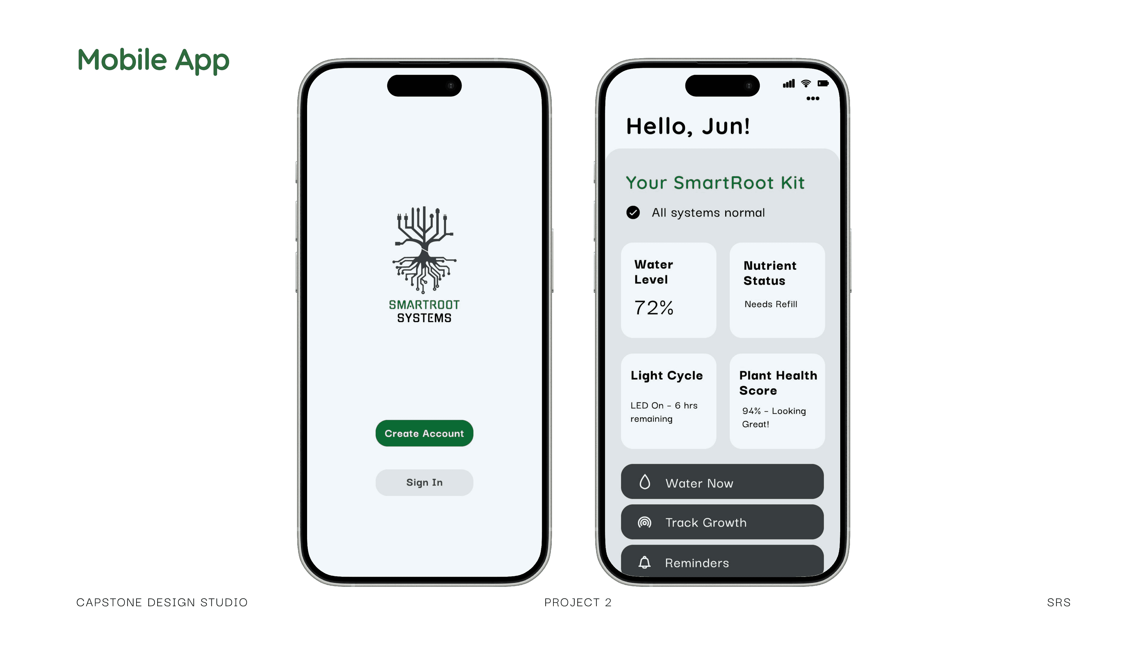
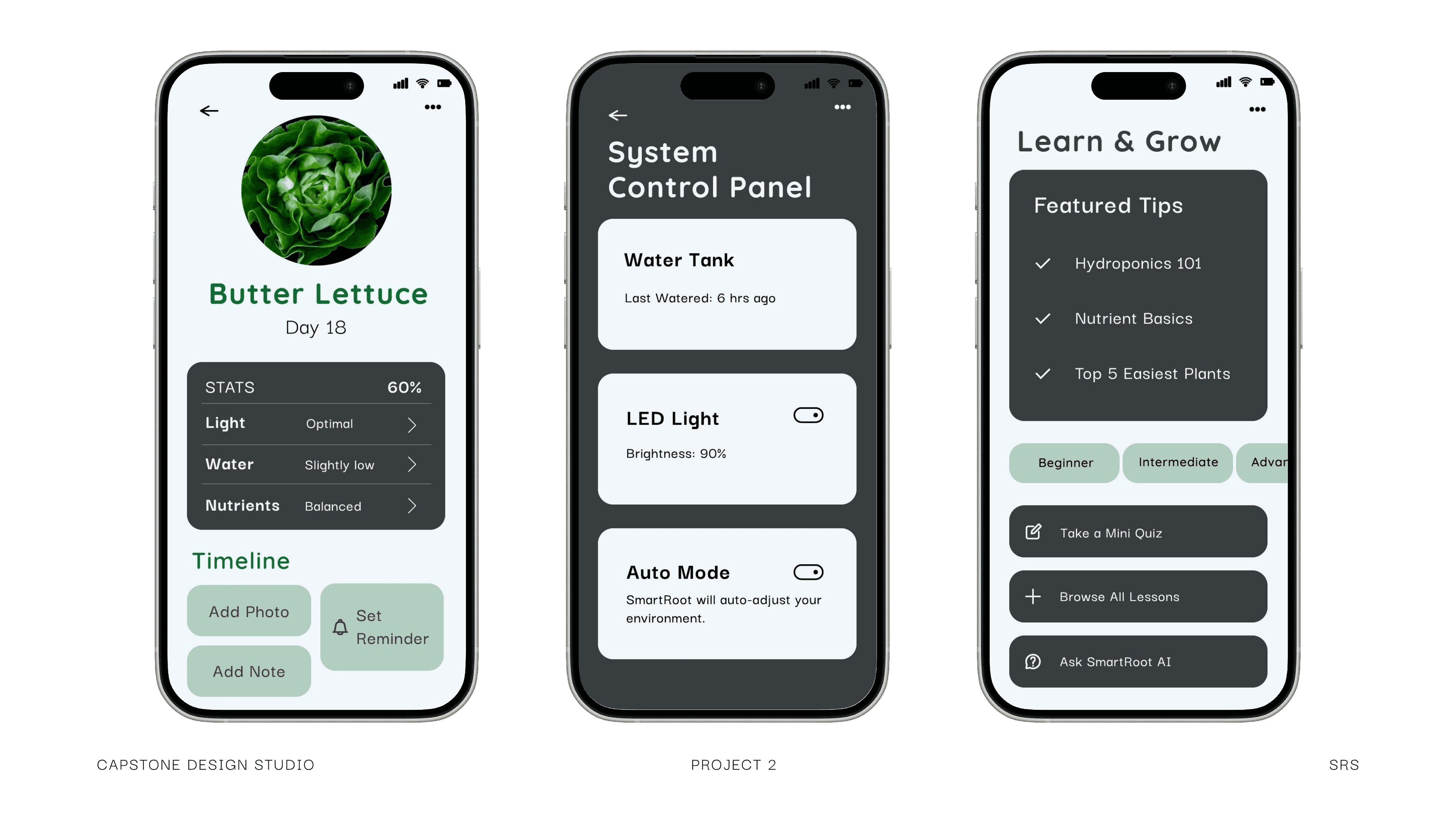
Companion App
Calm data display for everyday growing.
Dashboard built around actionable status, not raw sensor data. Green, amber, red indicators with clear recommendations. Calm data over comprehensive data.
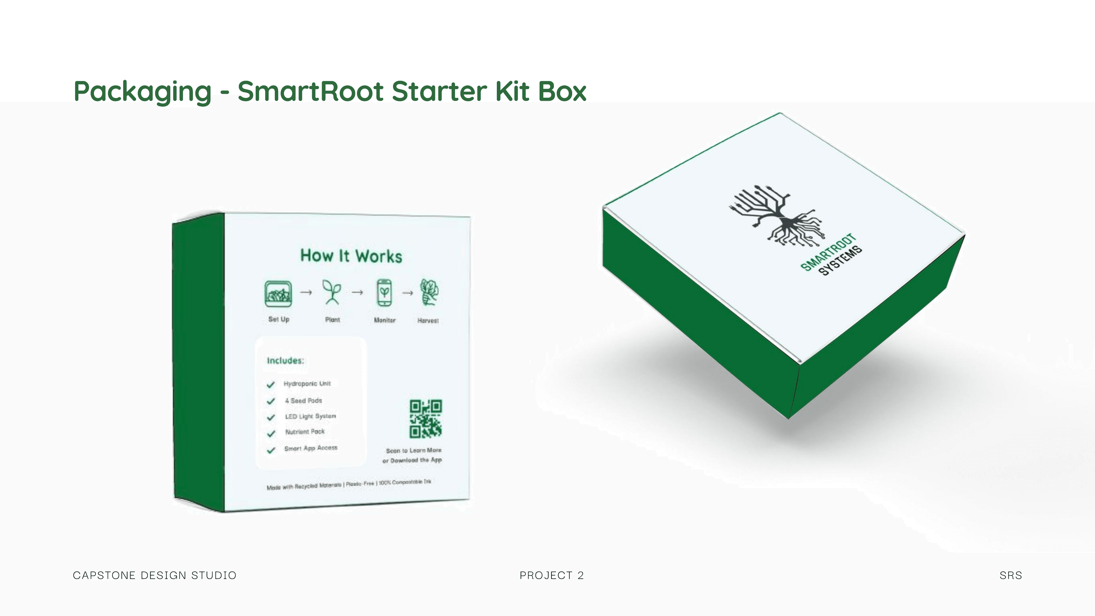
Packaging
Unboxing as part of the experience.
Unboxing mirrors the app's onboarding flow. Opening the box and setting up software feel like one continuous moment.
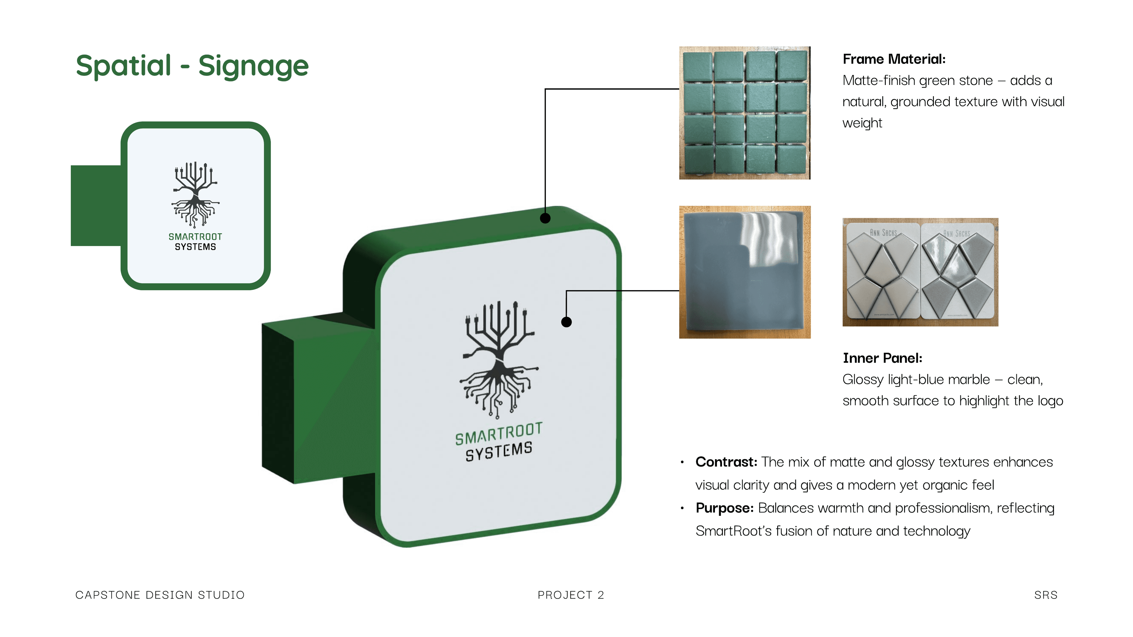
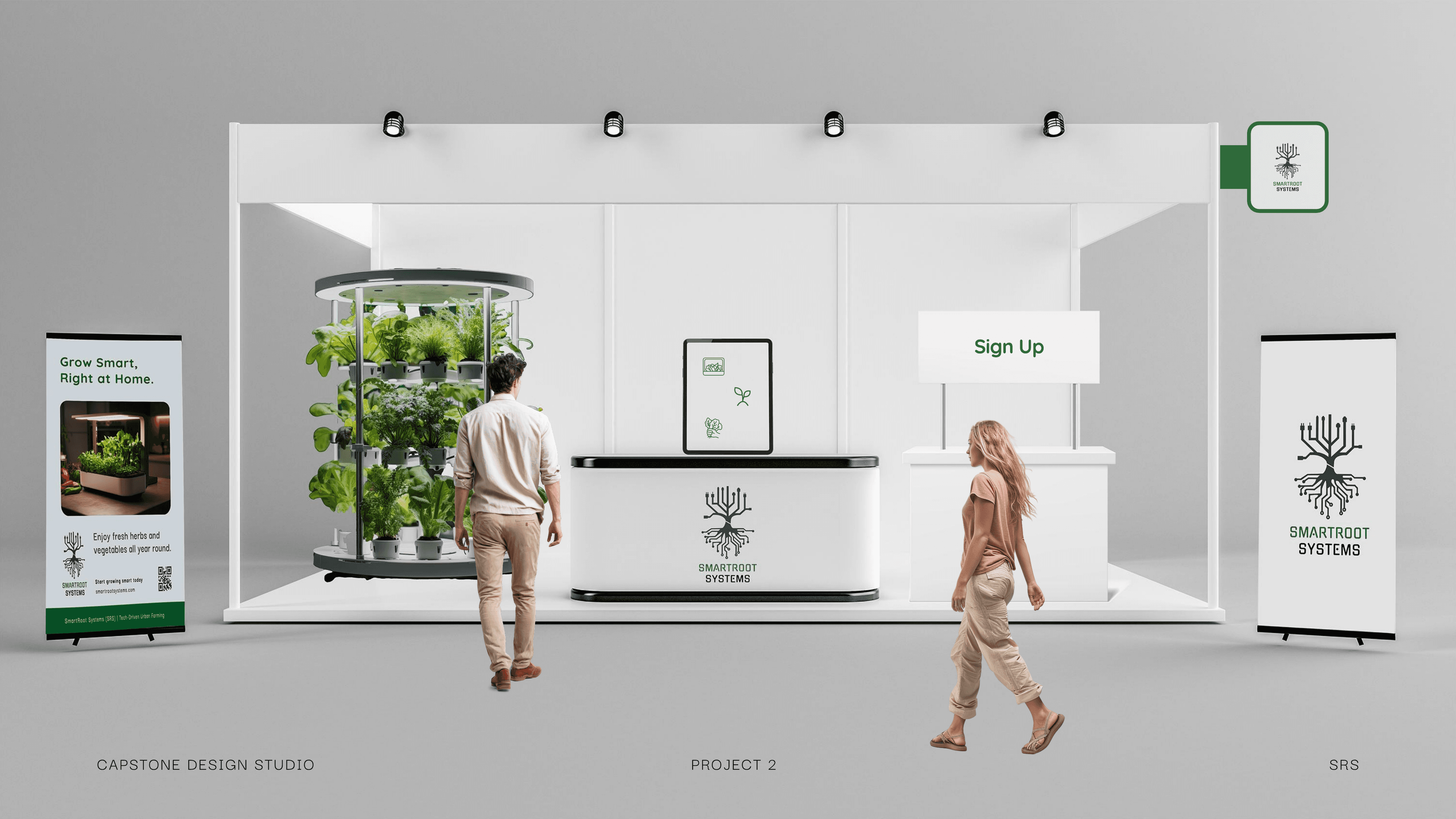
Spatial & Advertising
How the brand occupies physical space.
Same layout grid and typography at both scales: immersive booth and small shelf display. No separate retail assets needed.

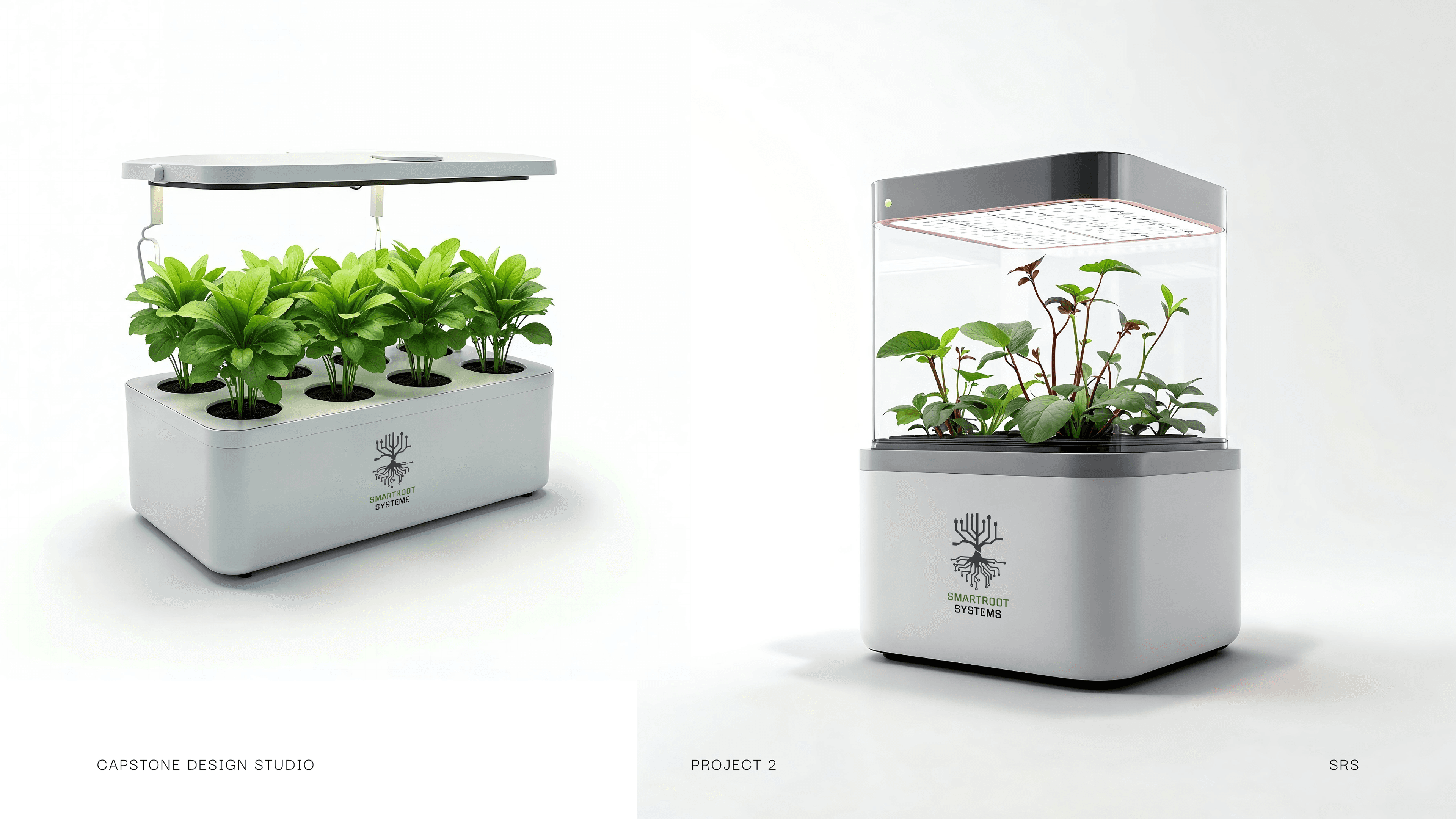
Product
Smart hydroponic units for any home.
Design decisions
Choices that held the system together.
Green as the single brand color
One hue palette forces consistency. Every accent, CTA, and status indicator uses the same green family across all touchpoints.
Geometric forms over organic illustration
Geometric precision signals technology, differentiating from hobbyist gardening brands that default to botanical illustration.
Same grid across digital and physical
App, website, packaging, and booth all use the same grid. Structural consistency, not decorative.
Outcome
One design language, proven across four touchpoints.
When foundational decisions (color, grid, typography) are strong enough, they transfer across touchpoints without modification. Consistency comes from shared principles, not repeated elements.